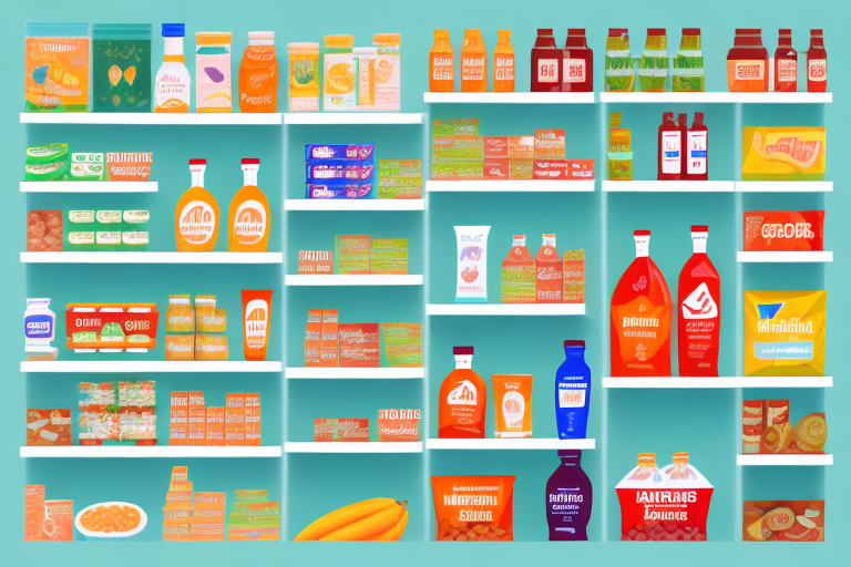
If you own a grocery store, you need a tool to help you compare prices, product quality, customer satisfaction, and supplier performance. Comparison charts are an effective and efficient way to gain valuable insights into your business operations. In this article, we will explore the importance of comparison charts in grocery store business and how to create them.
Understanding the Importance of Comparison Charts in Grocery Store Business
The grocery store industry is highly competitive, and having access to reliable data is crucial for making informed decisions. Comparison charts help you identify the strengths and weaknesses of your business, improve your products and services, and increase customer satisfaction. They also help you benchmark your performance against your competitors, and identify opportunities for growth and development.
Benefits of using comparison charts
There are several benefits of using comparison charts in grocery store business. Firstly, they help you analyze data and identify trends quickly. By comparing your business’s performance against industry benchmarks and competitors, you can quickly identify areas where you are excelling and areas where you need to improve. Secondly, they help you make data-driven decisions and improve your bottom line. By having access to reliable data, you can make informed decisions about pricing, product selection, and marketing strategies. Thirdly, they help you communicate your findings to customers, suppliers, and stakeholders effectively. By presenting data in an easy-to-understand format, you can communicate your business’s strengths and achievements to stakeholders. Lastly, they help you stay ahead of the competition by providing valuable insights into market trends and consumer preferences. By analyzing industry trends, you can identify opportunities for growth and development.
Identifying key performance indicators (KPIs)
Before creating comparison charts, you need to identify the key performance indicators (KPIs) that are relevant to your business. These KPIs will vary depending on the size and scope of your business. However, some of the common KPIs for grocery stores include sales revenue, profit margins, customer satisfaction ratings, customer retention rates, and supplier performance ratings. By collecting data on these KPIs, you can create meaningful comparison charts.
Another important KPI for grocery stores is inventory turnover. Inventory turnover is the rate at which a grocery store sells its inventory and replaces it with new stock. A high inventory turnover rate indicates that a grocery store is selling its products quickly, which can lead to increased profits. On the other hand, a low inventory turnover rate can indicate that a grocery store is holding onto inventory for too long, which can lead to spoilage and waste.
Customer acquisition cost (CAC) is another important KPI for grocery stores. CAC measures the cost of acquiring a new customer. By tracking CAC, grocery stores can identify which marketing strategies are most effective and allocate resources accordingly.
In addition to these KPIs, grocery stores may also track metrics related to employee performance, such as sales per employee and customer service ratings. By tracking these metrics, grocery stores can identify areas where employees may need additional training or support.
Types of Comparison Charts for Grocery Stores
Grocery stores are a competitive business, with numerous players vying for market share. In order to stay ahead of the competition, it is important to have a comprehensive understanding of your business operations. One way to achieve this is by using comparison charts. There are several types of comparison charts that you can use in your grocery store business. Each type of chart provides you with a unique perspective on your business operations, allowing you to make informed decisions.
Price comparison charts
Price comparison charts help you compare the prices of your products with those of your competitors. By analyzing the data, you can identify pricing strategies that work well and those that need improvement. This information can help you make pricing decisions that are advantageous to your business and your customers. For example, you may find that your prices are higher than those of your competitors for certain products. This could be due to higher overhead costs or a lack of bargaining power with suppliers. Armed with this information, you can take steps to reduce costs or negotiate better deals with suppliers, allowing you to offer more competitive prices to your customers.
On the other hand, you may find that your prices are lower than those of your competitors for certain products. This could be due to a pricing strategy that is not sustainable in the long term. By analyzing the data, you can identify which products are being sold at a loss and take steps to adjust your pricing strategy accordingly.
Product quality comparison charts
Product quality is an important factor for customers when choosing where to shop. Product quality comparison charts help you compare the quality of your products with those of your competitors. By collecting data on customer feedback, you can identify product features and characteristics that are important to your target audience. This information can help you improve your products and increase customer satisfaction. For example, you may find that customers are dissatisfied with the freshness of your produce. This could be due to a lack of attention to proper storage or transportation. Armed with this information, you can take steps to improve your supply chain management and ensure that your produce is always fresh and of high quality.
Customer satisfaction comparison charts
Customer satisfaction is a key metric for any business. Customer satisfaction comparison charts help you compare your customer satisfaction ratings with those of your competitors. By analyzing the data, you can identify areas where your business is strong and those that require improvement. This information can help you improve your products and services and boost your customer engagement. For example, you may find that customers are dissatisfied with the cleanliness of your store. This could be due to a lack of attention to detail in cleaning or a shortage of staff. Armed with this information, you can take steps to improve your cleaning procedures and hire additional staff to ensure that your store is always clean and welcoming to customers.
Supplier performance comparison charts
Suppliers play a critical role in the success of any grocery store. Supplier performance comparison charts help you compare the performance of your suppliers with those of your competitors. By analyzing the data, you can identify the suppliers that provide the best value, quality, and reliability. This information can help you negotiate better deals with your suppliers and improve your supply chain management. For example, you may find that one of your suppliers consistently delivers products late or with defects. Armed with this information, you can take steps to find a more reliable supplier or negotiate better terms with your current supplier to ensure that your business operations are not impacted by late or defective deliveries.
Overall, comparison charts are a valuable tool for any grocery store business. By using them to analyze your business operations, you can identify areas for improvement and make informed decisions that will help you stay ahead of the competition.
Gathering Data for Your Comparison Charts
Creating comparison charts can be a powerful tool for businesses to analyze data and make informed decisions. However, to create meaningful comparison charts, you need to collect accurate and relevant data. There are several ways to gather data for your charts, including:
Conducting Market Research
Market research is the process of gathering information about a particular market or industry. It helps you understand consumer behavior and preferences, as well as identify opportunities for growth and development. Market research can be conducted through surveys, focus groups, and other methods.
For example, if you are creating a comparison chart to analyze the performance of different brands of smartphones, you may conduct market research to gather data on consumer preferences, such as screen size, battery life, and camera quality. This information can help you identify which features are most important to consumers and which brands are meeting those needs.
Collecting Customer Feedback
Customer feedback is a valuable source of information for businesses. By collecting data on customer feedback, you can identify areas where you need improvement and those where you excel. This information can help you improve your products and services, and increase customer satisfaction.
There are several ways to collect customer feedback, including surveys, customer reviews, and social media monitoring. For example, if you are creating a comparison chart to analyze the performance of different airlines, you may collect customer feedback on factors such as on-time performance, customer service, and baggage handling. This information can help you identify which airlines are meeting customer needs and which ones need improvement.
Analyzing Sales Data
Sales data provides you with insights into your business operations. By analyzing sales data, you can identify trends, patterns, and opportunities for growth. This information can help you make informed decisions, improve your products and services, and increase your competitiveness.
For example, if you are creating a comparison chart to analyze the performance of different retail stores, you may analyze sales data to identify which products are selling well and which ones are not. This information can help you make decisions about inventory management and product development.
Tracking Supplier Performance
Supplier performance data helps you monitor your supply chain operations. By tracking supplier performance, you can identify areas where you need improvement and those where you excel. This information can help you negotiate better deals with your suppliers and improve your business operations.
For example, if you are creating a comparison chart to analyze the performance of different manufacturing companies, you may track supplier performance to identify which suppliers are meeting delivery deadlines and which ones are causing delays. This information can help you make decisions about supplier relationships and production scheduling.
In conclusion, gathering accurate and relevant data is essential for creating meaningful comparison charts. By conducting market research, collecting customer feedback, analyzing sales data, and tracking supplier performance, businesses can make informed decisions and improve their operations.
Designing Effective Comparison Charts
Designing effective comparison charts requires careful consideration of the purpose, audience, and context of your charts. Some of the tips for designing effective comparison charts include:
Choosing the right chart type
The type of chart you choose will depend on the data you want to represent. Some of the common chart types for comparison charts include bar charts, line charts, and pie charts. Choose a chart type that best represents your data and is easy to read and understand.
Visualizing data with colors and symbols
Colors and symbols can help you highlight important data points and communicate your findings effectively. Use colors and symbols sparingly and consistently to avoid confusing your audience.
Ensuring readability and clarity
Readability and clarity are crucial for effective communication. Use clear and concise language, and avoid jargon and technical terms. Use appropriate font sizes and styles, and ensure that your charts are legible and easy to read.
Incorporating branding elements
Incorporating branding elements in your charts can help you reinforce your brand identity and create a consistent visual language across all your marketing materials. Use appropriate colors, logos, and fonts to create a cohesive and professional look and feel.
In conclusion, comparison charts are a valuable tool for grocery store owners who want to gain insights into their business operations, make data-driven decisions, and stay ahead of the competition. By identifying KPIs, gathering relevant data, and designing effective charts, you can improve your products and services, increase customer satisfaction, and grow your business. Use these tips to create meaningful and informative comparison charts for your grocery store business.