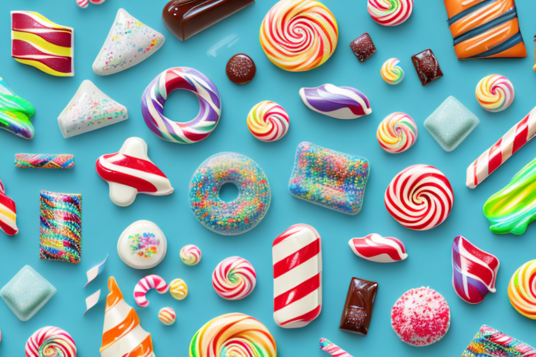
Running a confectionery business can be a sweet and satisfying venture but, with competition in the industry increasing, you need to find ways to stand out. One effective way to differentiate your business from others is by showcasing your products’ unique features through comparison charts. In this article, we will explore the importance of comparison charts in the confectionery industry and guide you on how to create them.
Understanding the Importance of Comparison Charts in the Confectionery Industry
Comparison charts are useful tools for highlighting the features and benefits of a product compared to that of its competitors. In the confectionery industry, competition is intense, and consumers can be overwhelmed with choices when it comes to satisfying their sweet tooth. With comparison charts, you can make it easier for your customers to choose your products over others. They enable you to showcase your products in a way that communicates their unique selling points and features, making them more appealing to customers.
Analyzing Competitors’ Products
The first step in creating a comparison chart is to analyze your competitors’ products. This means researching their products and identifying their key features and benefits. Look at their packaging, size, ingredients, flavors, quality, price, and target audience. By analyzing your competitors’ products, you can gain insights into the market and identify areas where you can improve your products.
For example, let’s say you’re a confectionery company that specializes in organic candies. By analyzing your competitors’ products, you may find that many of them use artificial colors and flavors. This could be an opportunity for you to differentiate your products by highlighting the fact that your candies are made with all-natural ingredients.
Identifying Key Product Features for Comparison
After analyzing your competitors’ products, the next step is to identify the key features of your own products that you want to compare. Are your products organic or have unique flavors? Are they gluten-free or packaged in an eco-friendly way? By identifying these features, you can create a comparison chart that emphasizes your products’ strengths compared to your competitors’ products.
For instance, if you specialize in organic candies, you may want to compare your products to those of your competitors based on the quality of the ingredients used. You could highlight the fact that your candies are made with all-natural ingredients, while your competitors’ products may contain artificial preservatives or additives.
Showcasing Your Unique Selling Points
It’s essential to showcase your unique selling points (USPs) in your comparison chart. These are the features that make your products stand out. Whether it’s your packaging, quality, or flavor, highlighting your USPs can help you differentiate your products from the competition. Your USPs should be clear, concise, and easy to understand.
For example, if your candies are packaged in an eco-friendly way, you could highlight this as a USP in your comparison chart. This could appeal to customers who are environmentally conscious and looking for products that align with their values.
In conclusion, comparison charts are powerful tools for confectionery companies looking to differentiate their products and stand out in a crowded market. By analyzing competitors’ products, identifying key product features, and showcasing your unique selling points, you can create a comparison chart that highlights the strengths of your products and makes them more appealing to customers.
Choosing the Right Type of Comparison Chart
When it comes to presenting information in a clear and organized manner, comparison charts are an excellent tool to use. However, with so many different types of comparison charts available, it can be challenging to know which one is best suited for your needs.
Before you choose a comparison chart, it’s essential to consider the type of information you want to convey and your target audience. This will help you select the right type of chart that effectively communicates your message.
Tabular Comparison Charts
Tabular comparison charts are best for presenting detailed information and comparing multiple products side by side. They provide a clear and organized way to display information, making it easy for your audience to compare and contrast different products.
With tabular comparison charts, you can easily highlight specific features and benefits in the table, making it an excellent choice for technical or analytical audiences who require in-depth information.
Bar Graphs and Column Charts
Bar graphs and column charts are best for comparing products in terms of numerical data like price or quantity. They are easy to read and visually appealing, making them an excellent choice for a general audience.
With bar graphs and column charts, you can quickly and effectively compare different products based on specific criteria, such as price, quantity, or size. This makes it an excellent choice for businesses looking to compare their products against competitors or for consumers looking to make informed purchasing decisions.
Pie Charts and Donut Charts
Pie charts and donut charts are useful for comparing percentages or ratios between products. They are visually stunning and easy to understand, making them ideal for displaying information that is easy to grasp at a glance.
With pie charts and donut charts, you can effectively communicate the proportion of different products or features, making it an excellent choice for businesses looking to showcase their market share or for consumers looking to compare different products based on specific criteria.
Infographics and Visual Comparisons
Infographics and visual comparisons are powerful tools for comparing complex data or information. They are visually appealing and can effectively communicate ideas that are difficult to convey through written text.
With infographics and visual comparisons, you can effectively communicate complex information in a way that is easy to understand and visually engaging. However, it’s important to note that these types of charts can be time-consuming and expensive to create, making them better suited for larger businesses or organizations.
Ultimately, the type of comparison chart you choose will depend on your specific needs and the type of information you want to convey. By carefully considering your audience and the message you want to communicate, you can select the right type of comparison chart that effectively communicates your message and achieves your desired outcome.
Collecting and Organizing Data for Your Comparison Chart
Collecting data and organizing it in a structured way is essential for creating an effective comparison chart. Your chart should be based on reliable data sources to ensure accuracy and transparency. In this article, we will discuss various methods of collecting data to create a comprehensive comparison chart.
Researching Competitor Products
Researching your competitors’ products is the first step in collecting data. By analyzing your competitors’ products, you can gain insights into the market and identify areas where you can differentiate yourself from the competition. You can use their website, social media, or product catalogs to gather information on their products’ features and benefits. Look for strengths and weaknesses that you can compare with your products. For example, if your competitor’s product has a longer shelf life, you can highlight the freshness of your product as a unique selling point.
Gathering Customer Feedback and Reviews
Gathering feedback from your customers is an excellent way to collect data on what they like and dislike about your products compared to your competitors. You can use customer reviews on your website, surveys, or focus groups to gather this information. By analyzing customer feedback, you can identify areas where your product is performing well and areas where you need to improve. For example, if customers consistently praise your product’s taste, you can highlight this as a key feature in your comparison chart.
Utilizing Industry Reports and Market Research
Using industry reports and market research can provide valuable insights into the confectionery industry’s overall trends, strengths, and weaknesses. This information can help you identify areas where you can differentiate yourself from the competition. For example, if the market trend is moving towards healthier snacks, you can highlight the natural ingredients in your product as a unique selling point. You can also use market research to identify gaps in the market that you can fill with your product.
Organizing Data in Spreadsheets
Organizing the data in spreadsheets can help you create a structure for your comparison chart that is easy to understand. You can use spreadsheets to compare data between products and easily identify the key features you want to highlight. For example, you can create a spreadsheet that compares the nutritional value, price, and taste of your product with your competitors’ products. By organizing the data in this way, you can create a comprehensive comparison chart that provides valuable information to your customers.
In conclusion, collecting and organizing data is essential for creating an effective comparison chart. By utilizing various data sources and organizing the data in a structured way, you can create a comprehensive comparison chart that highlights your product’s unique selling points and differentiates it from the competition.
Designing an Effective and Visually Appealing Comparison Chart
Designing an effective and visually appealing comparison chart is essential for engaging your customers and making your products stand out. You need to select the right chart design software and incorporate your brand’s visual identity into your chart.
Selecting the Right Chart Design Software
There are many chart design software options available, like Canva or Adobe Illustrator. Selecting the right software depends on your expertise level and the design capabilities you require. You will need to have experience in designing charts to create an effective and visually appealing comparison chart.
Incorporating Your Brand’s Visual Identity
It’s vital to incorporate your brand’s visual identity into your chart to reinforce your branding and ensure your chart stands out. Use your brand’s colors, fonts, and logos to make your chart visually appealing and easily recognizable.
Ensuring Readability and Clarity
Your chart must be readable and clear to convey the information effectively. Use a font that is easy to read, and ensure your text is large enough to see clearly. Organize your data in a structured way that is simple to understand.
Adding Interactive Elements for Enhanced Engagement
Adding interactive elements like animations or hyperlinks can make your chart more engaging and improve your customers’ experience. However, be mindful not to overcomplicate your chart, as this can be overwhelming and frustrating for your customers.
Conclusion
Creating comparison charts for your confectionery products can be an effective way to differentiate yourself from your competitors and showcase your unique features. By analyzing your competitors’ products, identifying your products’ key features, and gathering reliable data, you can create a chart that effectively communicates your products’ benefits. By selecting the right type of comparison chart, designing it appropriately and adding interactive elements, you can make your chart visually appealing and improve your customers’ experience. Utilize these tips to create an effective comparison chart that enables you to stand out in the confectionery industry.